An onboarding screen, also known as a welcome screen or a getting started screen, is a series of introductory screens that appear when a user first launches a mobile app or software application. The primary purpose of onboarding screens is to provide users with essential information about the app’s features, functionalities, and how to navigate through it effectively.
Onboarding screens typically include:
- Welcome Message: A friendly greeting that welcomes users to the app.
- Introduction to Features: Brief descriptions or highlights of key features and functionalities of the app.
- Instructions or Tutorials: Step-by-step instructions or interactive tutorials demonstrating how to use the app’s various features.
- Visual Illustrations or Graphics: Images or animations that visually represent the app’s interface and functionalities.
- Call-to-Action Buttons: Buttons that prompt users to take specific actions, such as signing up, logging in, or accessing further content.
- Benefits and Value Proposition: Explanation of the benefits users will gain from using the app and its value proposition.
The goal of onboarding screens is to guide users through the initial setup process, help them understand the app’s purpose and functionality, and ultimately increase user engagement and retention by ensuring a smooth and intuitive user experience from the outset. In Flutter, developers can create visually appealing and interactive onboarding screens using various widgets and animations available in the framework.
How to Create Onboarding Screen in Fluttter
Creating an onboarding screen in Flutter involves designing a series of introductory screens that provide essential information about your app’s features and functionalities. Here’s a basic guide to help you get started:
- Create a New Flutter Project: If you haven’t already, create a new Flutter project using the Flutter SDK and your preferred IDE (such as Android Studio or Visual Studio Code).
- Design Onboarding Screens: Design the layout and content for your onboarding screens. You can use Flutter’s widgets to create various UI elements such as text, images, buttons, and animations.
- Create a StatefulWidget: To manage the state of your onboarding screens, create a StatefulWidget. This will allow you to update the UI based on user interactions or progress through the onboarding process.
- Implement PageView: Use Flutter’s PageView widget to display the onboarding screens as a series of swipeable pages. Each page represents a different screen in the onboarding flow.
- Navigation: Implement navigation controls to allow users to move between onboarding screens. You can use buttons, swipes, or any other interaction method that fits your app’s design.
- Persist User’s Onboarding Status: Optionally, you may want to persist the user’s onboarding status to prevent them from seeing the onboarding screens again after they’ve completed the process. You can use shared preferences or any other storage mechanism supported by Flutter for this purpose.
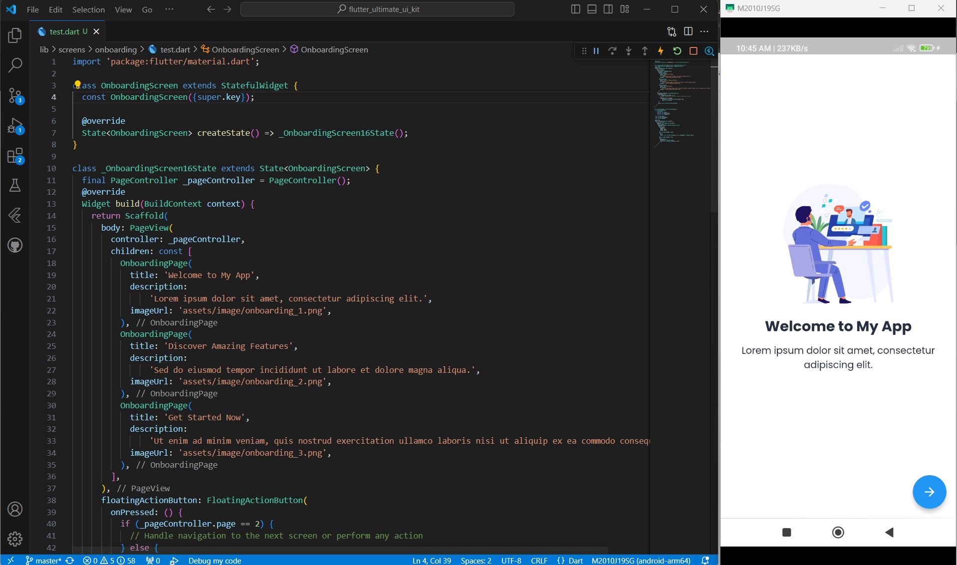
Here’s a simplified example of how you might structure your Flutter code to create an onboarding screen:
import 'package:flutter/material.dart';

class OnboardingScreen extends StatefulWidget {
  const OnboardingScreen({super.key});

  @override
  State<OnboardingScreen> createState() => _OnboardingScreen16State();
}

class _OnboardingScreen16State extends State<OnboardingScreen> {
  final PageController _pageController = PageController();
  @override
  Widget build(BuildContext context) {
    return Scaffold(
      body: PageView(
        controller: _pageController,
        children: const [
          OnboardingPage(
            title: 'Welcome to My App',
            description:
                'Lorem ipsum dolor sit amet, consectetur adipiscing elit.',
            imageUrl: 'assets/image/onboarding_1.png',
          ),
          OnboardingPage(
            title: 'Discover Amazing Features',
            description:
                'Sed do eiusmod tempor incididunt ut labore et dolore magna aliqua.',
            imageUrl: 'assets/image/onboarding_2.png',
          ),
          OnboardingPage(
            title: 'Get Started Now',
            description:
                'Ut enim ad minim veniam, quis nostrud exercitation ullamco laboris nisi ut aliquip ex ea commodo consequat.',
            imageUrl: 'assets/image/onboarding_3.png',
          ),
        ],
      ),
      floatingActionButton: FloatingActionButton(
        onPressed: () {
          if (_pageController.page == 2) {
            // Handle navigation to the next screen or perform any action
          } else {
            _pageController.nextPage(
                duration: const Duration(milliseconds: 500),
                curve: Curves.ease);
          }
        },
        child: const Icon(Icons.arrow_forward),
      ),
    );
  }
}

class OnboardingPage extends StatelessWidget {
  const OnboardingPage(
      {super.key,
      required this.title,
      required this.description,
      required this.imageUrl});

  final String title;
  final String description;
  final String imageUrl;

  @override
  Widget build(BuildContext context) {
    return Container(
      padding: const EdgeInsets.all(20.0),
      child: Column(
        mainAxisAlignment: MainAxisAlignment.center,
        children: [
          Image.asset(
            imageUrl,
            width: 200.0,
            height: 200.0,
          ),
          const SizedBox(height: 20.0),
          Text(
            title,
            style: const TextStyle(fontSize: 24.0, fontWeight: FontWeight.bold),
          ),
          const SizedBox(height: 10.0),
          Text(
            description,
            textAlign: TextAlign.center,
            style: const TextStyle(fontSize: 16.0),
          ),
        ],
      ),
    );
  }
}
In this example, OnboardingPage is a custom widget representing an individual onboarding screen. You can customize the content and appearance of each onboarding screen by passing different values for the title, description, and imageUrl parameters.
The PageView widget is used to display the onboarding screens as a series of swipeable pages. The PageController is used to control the navigation between pages.
Finally, a FloatingActionButton is added to allow users to navigate to the next onboarding screen or perform any other action.
Top Flutter Onboarding Screen Widgets
Coding by yourself is always better, but if you want to save time and effort, you can always use ready-made Flutter Onboarding Screen widgets. These widgets offer pre-built components and functionalities to quickly implement engaging onboarding experiences in your Flutter apps. By leveraging these top Flutter Onboarding Screen widgets, you can streamline your development process and focus more on enhancing the user experience rather than reinventing the wheel. Let’s explore some of the most popular options available in the Flutter ecosystem.
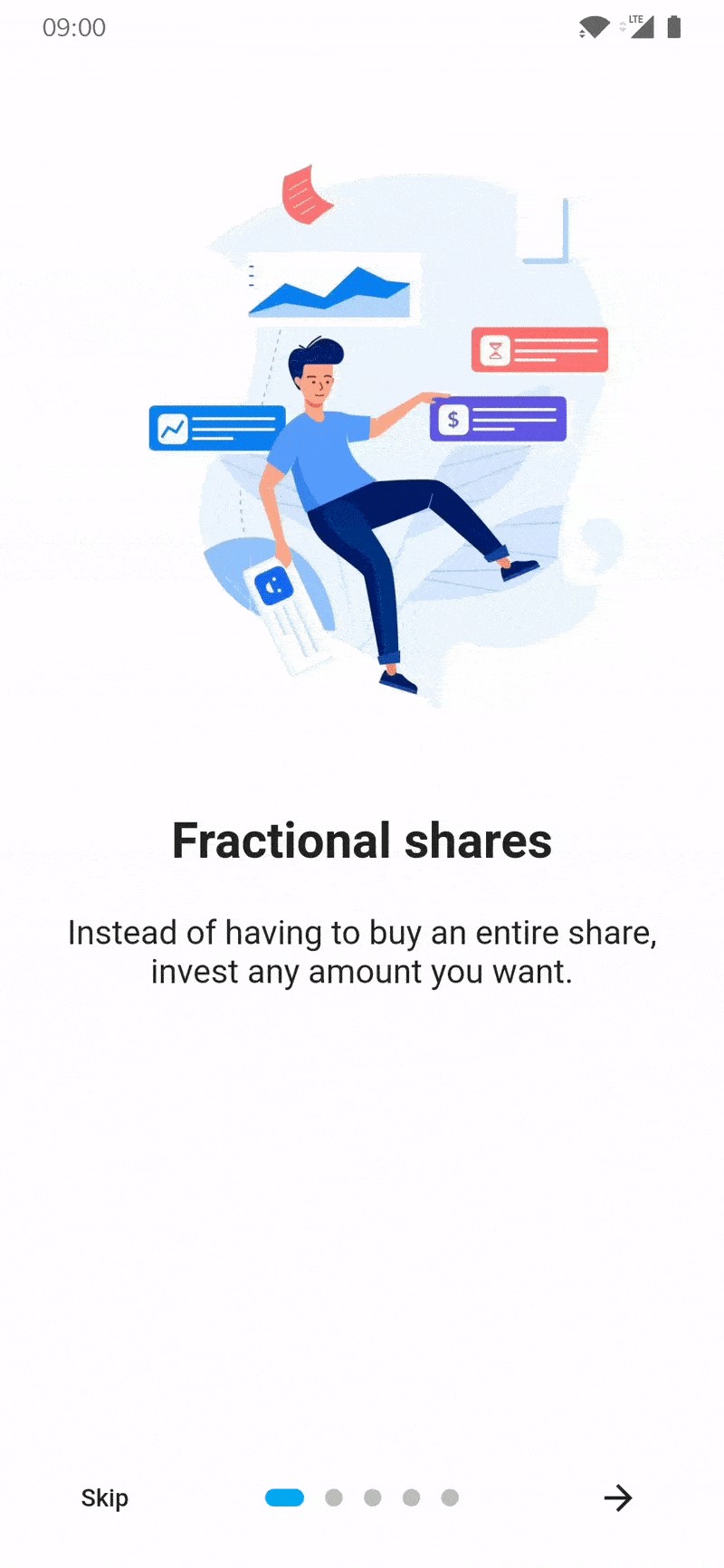
1. Ultimate Flutter UI Kit Onboarding Screen Collection
The Ultimate Flutter UI Kit Onboarding Screen Collection offers a comprehensive selection of professionally designed onboarding screens to kickstart your app development journey. With this kit, you gain access to a diverse range of visually appealing and customizable onboarding screen templates that seamlessly integrate into your Flutter projects. Whether you’re building a social media platform, e-commerce app, or productivity tool, this collection provides you with the flexibility to tailor the onboarding experience to match your app’s branding and user preferences. Say goodbye to tedious design work and hello to accelerated development with this invaluable resource.
Thanks to its easy-to-customize nature, developers can tailor the onboarding screens to match their app’s branding and design language effortlessly. Whether you’re building a sleek modern app or a vibrant, colorful interface, this collection provides the flexibility and versatility needed to create engaging user experiences that leave a lasting impression.
2. introduction_screen
“Introduction Screen” is a powerful Flutter widget designed to provide a seamless introduction for users on an app’s first launch. Whether you aim to explain the app’s features, showcase its capabilities, or simply welcome users aboard, this widget offers unparalleled customization options coupled with exceptional design.
This widget seamlessly integrates with your Flutter application, allowing you to create captivating introductory screens with ease. From highlighting key functionalities to guiding users through essential app features, Introduction Screen empowers developers to craft immersive onboarding experiences that leave a lasting impression.
Behind the scenes, Introduction Screen leverages the functionality of another package, dots_indicator, to enhance its visual appeal and usability. Developed by the same creator, dots_indicator complements Introduction Screen by providing sleek and intuitive indicators that guide users through the onboarding process seamlessly.
With Introduction Screen and dots_indicator at your disposal, you can elevate your app’s first impression, engage users effectively, and set the stage for a delightful user experience. Whether you’re launching a new app or updating an existing one, this customizable widget duo offers the perfect solution for captivating user introductions.
3. intro_slider
“Flutter Intro Slider” is a versatile Flutter plugin designed to simplify the creation of engaging app introductions. With its intuitive features and customizable parameters, building captivating intros for your app has never been easier or faster.
This plugin offers a range of functionalities to enhance your intro creation process:
- IntroSlider Parameter: Customize the appearance and behavior of your intro slider with ease. Modify the frame slider, including next and done buttons, and adjust scroll behavior to fit your app’s design and user experience requirements.
- ContentConfig Parameter: Tailor the content of your intro slides to resonate with your audience. Customize titles, images, descriptions, and other content elements to effectively communicate your app’s value proposition and features.
- IndicatorConfig Parameter: Enhance navigation and user guidance with custom indicators. Define the style, position, and behavior of indicators to provide users with clear visual cues as they navigate through the intro slides.
- NavigationBarConfig Parameter: Personalize the navigation bar to suit your app’s aesthetics and user interface design. Customize its position, appearance, and functionality to ensure seamless navigation and interaction throughout the intro.
By leveraging the capabilities of Flutter Intro Slider, developers can create compelling app introductions that captivate users from the moment they launch the app. With its flexible parameters and intuitive customization options, this plugin empowers developers to craft intros that align perfectly with their app’s branding, design language, and user experience goals.
4. flutter_onboarding_slider
“Flutter OnBoarding Slider” is a dynamic Flutter package offering a page slider with captivating parallax design features. With this package, developers can effortlessly create immersive onboarding experiences that engage users from the moment they launch the app.
Key features of Flutter OnBoarding Slider include:
- Parallax Design: Enjoy the mesmerizing parallax effect that allows the background to slide at a different speed, creating a visually stunning backdrop for your onboarding screens.
- Bottom Controller: Seamlessly navigate through the onboarding screens with a bottom controller that indicates the current page, providing users with clear visual cues as they progress through the introduction.
- Skip Button: Simplify user interaction with a convenient skip button located in the top right corner, allowing users to bypass the onboarding process if desired. This button triggers a final function, enabling developers to define custom actions upon completion of the onboarding sequence.
- Customization Options: Tailor the appearance and functionality of the onboarding slider to suit your app’s design requirements. Utilize the
centerBackgroundproperty to center background images or thefinishButtonStyleproperty to customize the finish button according to your app’s visual identity.
With Flutter OnBoarding Slider, developers can effortlessly create visually stunning onboarding experiences that captivate users and set the stage for a memorable app journey. Whether you’re launching a new app or updating an existing one, this package offers the perfect solution for creating engaging introductory screens that leave a lasting impression.
5. onboarding
The “Onboarding” Flutter plugin is a user-friendly solution designed to enhance user engagement by providing a captivating onboarding experience for first-time users. As the name suggests, this plugin allows developers to create introductory screens, also known as onboarding screens, to welcome and guide users through their app’s features and functionalities.
Key features of the “Onboarding” plugin include:
- Header and Footer Builder: Simplify the process of customizing your onboarding screens by utilizing the header and footer builder. This feature allows developers to easily add branding elements, navigation controls, or any other content to the top and bottom sections of the onboarding screens.
- Swipe-able Widget: Create an interactive onboarding experience with a swipe-able widget that enables users to navigate through the introductory screens effortlessly. This intuitive gesture-based navigation enhances user engagement and promotes exploration of the app’s offerings.
- Custom Indicators: Extend the functionality of the plugin by leveraging the provided painter base class to build custom indicators. Developers have the flexibility to design unique visual indicators that complement their app’s design language and provide users with clear guidance as they progress through the onboarding process.
With the “Onboarding” plugin, developers can easily create polished and immersive onboarding experiences that leave a positive impression on first-time users. By leveraging the header and footer builder, swipe-able widget, and custom indicators, developers can tailor the onboarding screens to effectively communicate their app’s value proposition and drive user retention and engagement.