As Flutter continues to gain traction among developers for its flexibility and ease of use, understanding essential widgets like the AppBar is paramount. In this comprehensive guide, we’ll delve into what an AppBar is, its functionalities, and the different types available in Flutter applications. By the end, you’ll be equipped with the knowledge to create stunning app bars that elevate the user experience of your Flutter apps.
What is an AppBar?
An AppBar is a fundamental component in Flutter used to display a persistent header at the top of the screen. It serves as a container for important elements such as titles, icons, navigation controls, and more. Essentially, the AppBar provides users with contextual information and navigation options, enhancing the overall usability of the app.
Functions of an AppBar:
- Navigation: AppBars often include navigation controls such as back buttons, leading to improved user navigation within the app.
- Branding: It allows developers to incorporate branding elements such as logos and app names, maintaining brand consistency throughout the app.
- Actions: AppBars can host action buttons or icons, enabling users to perform specific tasks or actions within the app.
- Contextual Information: Displaying relevant information such as titles or subtitles helps users understand their current location within the app and the context of the content being viewed.
- Search: In some cases, AppBars may include search functionality, allowing users to search for specific content within the app.
Types of AppBars:
- Basic AppBar: The standard AppBar typically consists of a title, leading widget (such as a back button), and optional actions on the trailing side.
- SliverAppBar: SliverAppBar is a flexible variant of the AppBar commonly used in scrollable views, such as CustomScrollView or NestedScrollView. It can expand and shrink dynamically based on user interaction, providing a seamless scrolling experience.
- BottomAppBar: Unlike traditional AppBars positioned at the top of the screen, BottomAppBar is located at the bottom. It often includes navigation controls and actions, making it ideal for apps with bottom navigation patterns.
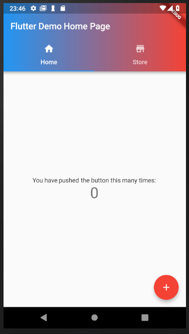
- AppBar with Tabs: This type of AppBar incorporates tab navigation, allowing users to switch between different sections or categories within the app.
- Custom AppBar: Developers can create fully customized AppBars tailored to their app’s design requirements and branding guidelines. Custom AppBars offer limitless possibilities for creativity and personalization.
Understanding the functionality and types of AppBars in Flutter is essential for building intuitive and user-friendly apps. Whether you’re creating a basic AppBar for a simple app or implementing a dynamic SliverAppBar for a more complex interface, mastering the AppBar widget opens doors to endless design possibilities in Flutter development. Stay tuned for the next part of this series, where we’ll dive into the implementation of various AppBar types in Flutter code.
How to Create a Flutter AppBar
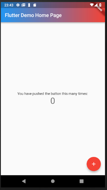
Here’s a straightforward illustration showcasing the process of creating a fundamental AppBar component within a Flutter application. This example serves to elucidate the essential steps and configurations required to implement a basic AppBar widget, offering developers a foundational understanding of its structure and functionality within the Flutter framework.
import 'package:flutter/material.dart';

class AppBar24 extends StatelessWidget {
  const AppBar24({super.key});

  @override
  Widget build(BuildContext context) {
    return Scaffold(
      appBar: AppBar(
        title: const Text('My Flutter App'),
        // Customize the leading widget
        leading: IconButton(
          icon: const Icon(Icons.menu),
          onPressed: () {
            // Handle menu button press
          },
        ),
        // Customize actions on the right side of the AppBar
        actions: [
          IconButton(
            icon: const Icon(Icons.search),
            onPressed: () {
              // Handle search button press
            },
          ),
          IconButton(
            icon: const Icon(Icons.notifications),
            onPressed: () {
              // Handle notifications button press
            },
          ),
        ],
      ),
      body: const Center(
        child: Text('Welcome to my Flutter app!'),
      ),
    );
  }
}
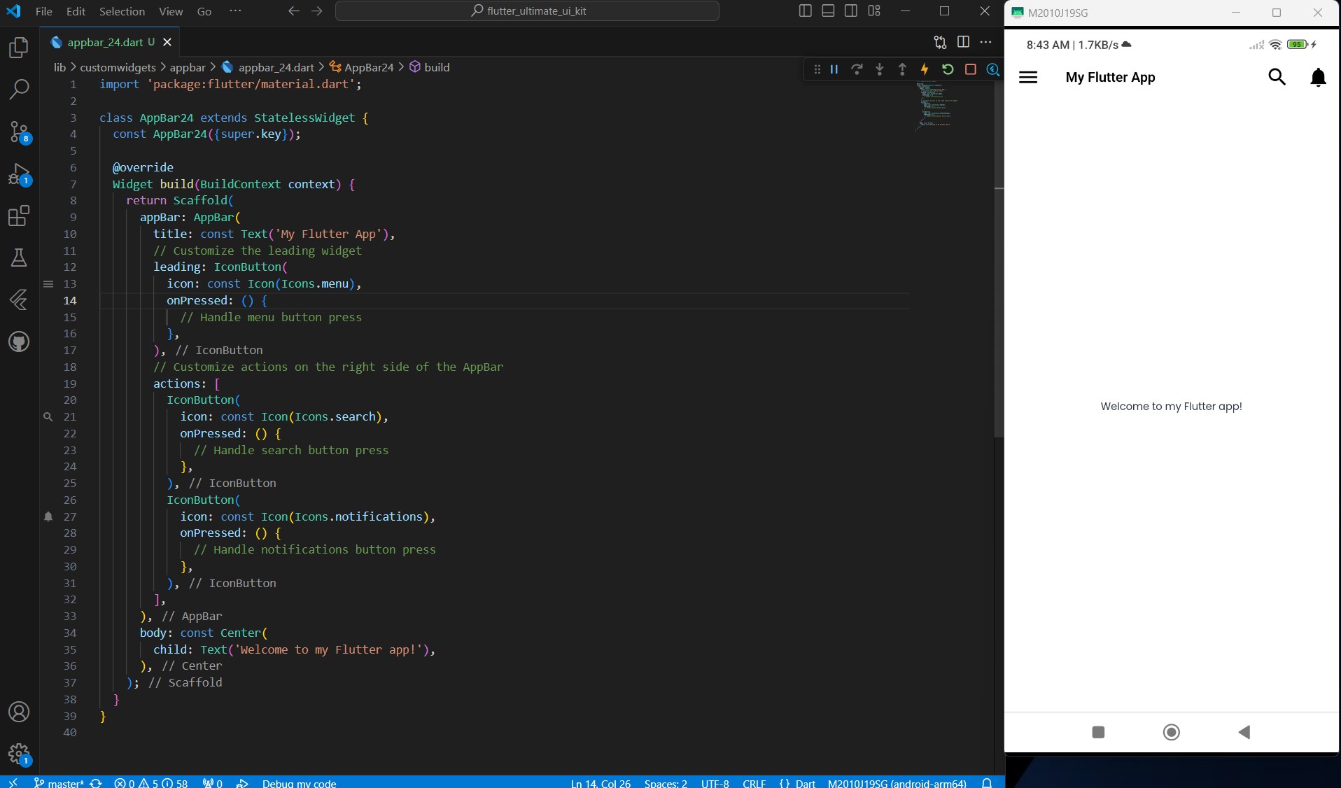
In this example:
- We create a Scaffold.
- Inside the Scaffold, we define an AppBar with a title “My Flutter App”.
- We customize the AppBar by adding a leading IconButton (icon: menu) and two action IconButtons (icons: search and notifications) on the right side.
- We define some placeholder onPressed functions for each button.
- Finally, we set the body of the Scaffold to display a simple welcome message in the center of the screen.
You can run this code in your Flutter project to see the basic AppBar in action. Feel free to customize the AppBar further to fit your app’s design and requirements.
Top Flutter AppBar Widgets / Packages
The AppBar is a quintessential component in any Flutter app, providing users with navigation options, contextual information, and brand identity. While Flutter offers a built-in AppBar widget, developers often seek additional functionality, customization, and design options. Thankfully, the Flutter ecosystem boasts a plethora of AppBar packages, each offering unique features to enhance the app’s user experience. We’ll explore some of the top Flutter AppBar widgets and packages to help you find the perfect fit for your app’s design needs.
1. Ultimate Flutter UI Kit App Bar Collection
The Ultimate Flutter UI Kit App Bar Collection is a valuable resource for Flutter developers seeking to enhance their app’s design and user experience. With 24 meticulously crafted app bar designs to choose from, developers can unlock their design potential and create visually stunning interfaces that captivate users and leave a lasting impression. Whether you’re a seasoned developer or just starting your Flutter journey, this collection offers inspiration, guidance, and limitless possibilities for creating exceptional app bars that stand out in the crowded app market. You can watch the video demo to see these app bars in action and experience their seamless integration with various app interfaces.
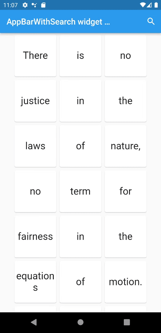
2. AppBar with search switch
The AppBarWithSearchSwitch offers a seamless transition between two different app bars based on the activation of a search field. Serving as a versatile replacement for the standard AppBar class, it is compatible with both stateless widgets and ValueNotifier, facilitating easy integration with various providers. Boasting full customization capabilities, this widget operates directly in place without necessitating additional variables elsewhere. Moreover, it supports custom animations, including prebuilt options such as AppBarAnimationSlideDown and AppBarAnimationSlideLeft. Additionally, optional helper features like AppBarSearchButton, AppBarOnEditListener, AppBarOnSubmitListener, and AppBarWithSearchFinder further enhance its functionality, and AppBarSpeechButton.
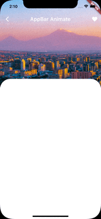
3. appbar_animate
The appbar_animated package is a Flutter library that provides animated app bars, allowing developers to add dynamic transitions and effects to their app bars. This package offers a range of animations that can be applied to app bars, enhancing the visual appeal and user experience of Flutter applications.
Key features of the appbar_animated package include:
- Animated Transitions: With
appbar_animated, developers can easily animate the appearance, disappearance, and transition of app bars using built-in animation effects. These animations can include sliding, fading, scaling, or any custom animation defined by the developer. - Customizable: The package offers customization options to tailor the animations and behaviors of the app bars according to the app’s design requirements. Developers can adjust parameters such as animation duration, easing curves, and animation triggers to achieve the desired effect.
- Easy Integration:
appbar_animatedis designed for seamless integration into Flutter applications. Developers can incorporate animated app bars into their projects with minimal setup and configuration, making it accessible even for developers with limited animation experience. - Versatile Usage: The package supports various types of app bars, including standard app bars, sliver app bars, and bottom app bars. This versatility allows developers to apply animated effects to different types of app bars across their Flutter apps.
Overall, the appbar_animated package provides a convenient solution for adding dynamic animations to app bars in Flutter applications. By leveraging its capabilities, developers can enhance the visual appeal and interactivity of their apps, resulting in a more engaging and polished user experience.
3. Sliver App Bar Builder
The “SliverAppBarBuilder” offers a highly customizable solution for implementing sliver app bars in Flutter applications, enriched with the flexibility of using builders. This widget empowers developers with extensive configurations to tailor the appearance and behavior of sliver app bars to suit their specific design requirements. With a wide range of options available, developers can effortlessly fine-tune every aspect of the sliver app bar, from its height and initial expansion state to its background, content, and actions. Whether you’re looking to create a sleek and minimalistic app bar or a feature-rich navigation hub, the SliverAppBarBuilder provides the tools necessary to bring your vision to life.
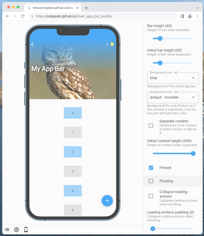
The SliverAppBarBuilder boasts support for various configurations, allowing developers to exert precise control over the appearance and functionality of their sliver app bars. From defining custom bar heights and initial expansion states to specifying background colors and content layouts, developers can craft sliver app bars that seamlessly integrate with their app’s design language and user experience goals. Additionally, the widget offers the flexibility to toggle between different configurations, such as collapsing behavior, content positioning, and stretching options, enabling developers to adapt the sliver app bar to different use cases and screen sizes with ease.
One of the standout features of the SliverAppBarBuilder is its utilization of builders, which streamline the process of composing complex app bar layouts and content structures. By leveraging builders, developers can dynamically generate app bar components, actions, and content based on runtime conditions, enhancing the widget’s versatility and adaptability. Furthermore, the SliverAppBarBuilder supports pinned mode, debug mode for visual debugging, and stretch configurations, providing developers with comprehensive tools for fine-tuning the behavior and appearance of their sliver app bars. Whether you’re a seasoned Flutter developer or just starting your journey, the SliverAppBarBuilder offers a powerful and intuitive solution for creating dynamic and customizable sliver app bars that elevate the user experience of your Flutter applications.
4. search_app_bar_page
The “search_app_bar_page” package is designed to streamline the creation of comprehensive and reactive search screens within Flutter applications. With its robust set of features and functionalities, this package aims to simplify the process of implementing search functionality, offering developers a convenient and efficient solution. The “search_app_bar_page” package is a valuable tool for Flutter developers seeking to incorporate robust and reactive search functionality into their applications. By automating the creation of search screens and offering reactive updates, this package simplifies the implementation process while ensuring a seamless and user-friendly search experience for app users.

5. Flutter Gradient App Bar
The “flutter_gradient_app_bar” package introduces a vibrant twist to the traditional Material AppBar in Flutter applications by enabling the integration of gradient backgrounds. Designed for developers seeking to infuse their app’s AppBar with dynamic colors and visual appeal, this package offers a seamless solution that retains all the functionality and familiarity of the standard AppBar. The “flutter_gradient_app_bar” package offers a simple yet powerful solution for incorporating gradient backgrounds into Flutter AppBar designs. With its seamless integration, customization options, and enhanced visual appeal, this package empowers developers to create AppBar layouts that are not only functional but also visually captivating and engaging for users.
Conclusion
In conclusion, mastering the art of designing and implementing AppBars in Flutter is essential for creating polished and intuitive user interfaces. Throughout this article, we’ve explored the fundamental concepts of AppBars, including their functionalities, types, and various customization options available through both built-in features and third-party packages. Whether you’re creating a basic AppBar with standard navigation controls or experimenting with advanced features like dynamic animations and gradient backgrounds, understanding the versatility and potential of AppBars allows developers to elevate the user experience of their Flutter applications. By leveraging the insights provided in this guide and exploring the diverse range of AppBar widgets and packages available in the Flutter ecosystem, developers can confidently craft visually stunning and highly functional AppBars that enhance navigation, convey context, and leave a lasting impression on users.