A carousel slider is a user interface element that displays a series of images or content items in a horizontal or sometimes vertical scrollable format. It’s designed to showcase multiple pieces of content within limited screen space, allowing users to easily browse through them by swiping or tapping. The carousel slider is commonly used in various types of mobile apps, including e-commerce, news, social media, and entertainment applications, to present products, articles, images, or other media in a visually appealing and interactive manner.
The primary function of a carousel slider in an app is to engage users and encourage exploration of content. By presenting multiple items in a visually dynamic way, the carousel slider attracts attention and entices users to interact with the app. It provides a convenient way for users to discover new products, articles, or media without overwhelming them with too much information at once. Additionally, carousel sliders can be used to highlight featured or promoted content, improving visibility and driving user engagement.
Key features of a carousel slider in an app should include smooth and responsive navigation, support for gestures such as swiping or tapping to browse through content, and customization options for developers to tailor the appearance and behavior of the slider to fit the app’s design and branding. It’s important for the carousel slider to be optimized for various screen sizes and orientations to ensure a consistent user experience across different devices. Additionally, features like autoplay, pagination, and the ability to pause or navigate manually through the carousel can enhance usability and user control. Overall, a well-designed carousel slider adds value to an app by providing an intuitive and visually appealing way for users to discover and interact with content.
Top Flutter Carousel Slider Widgets / Packages
Now that we grasp the significance of carousel sliders, let’s explore how to integrate them into a Flutter app. Flutter offers several packages and libraries that make it easy to create carousel sliders with minimal effort. Alternatively, you can create your own custom carousel widget, which offers several advantages compared to using packages. Here, we’ll delve into some of the top Flutter carousel slider widgets and packages, each offering unique features and capabilities:
1. Ultimate Flutter UI Kit Carousels Sliders Widgets
The “Ultimate Flutter UI Kit Carousels Sliders Widgets” is a comprehensive collection of hand-coded carousel slider widgets designed to enhance the user interface of Flutter projects. With a total of 30 carefully crafted carousel sliders, this UI kit offers a wide variety of options to developers seeking to integrate dynamic and visually appealing content sliders into their Flutter apps.
Each carousel slider in the UI kit is meticulously designed and optimized for seamless integration, allowing developers to effortlessly enhance their app’s user experience with engaging and interactive content presentation. Whether you’re building an e-commerce app, a news reader, or a multimedia gallery, these carousel sliders provide versatile solutions to showcase products, articles, images, and more.
With the “Ultimate Flutter UI Kit Carousels Sliders Custom Widgets,” developers can save valuable time and effort by leveraging pre-built carousel slider components that are ready to be implemented directly into their Flutter projects. This comprehensive collection eliminates the need for extensive coding and customization, empowering developers to focus on other aspects of app development while ensuring a polished and professional user interface.
Whether you’re a beginner or an experienced Flutter developer, the “Ultimate Flutter UI Kit Carousels Sliders Custom Widgets” offers an invaluable resource for adding eye-catching carousel sliders to your projects with ease and efficiency. Unlock the full potential of your Flutter apps and captivate users with stunning visual experiences using this extensive collection of hand-coded carousel slider widgets.
2. carousel_slider
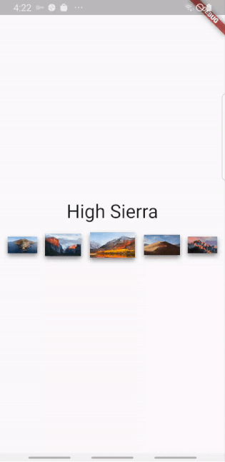
The carousel_slider package is a versatile solution for implementing carousel sliders in Flutter apps across multiple platforms, including Android, iOS, web, and desktop. With its rich feature set and cross-platform compatibility, this package empowers developers to create dynamic and engaging carousel sliders that enhance the user experience.

Key Features:
- Infinite Scroll: The carousel_slider widget supports infinite scrolling, allowing users to seamlessly navigate through a continuous loop of content items without reaching an end. This feature ensures a smooth and uninterrupted browsing experience, keeping users engaged with the carousel slider’s content.
- Custom Child Widgets: Developers have the flexibility to customize the content of each carousel slider item by using custom child widgets. This feature enables the creation of diverse carousel layouts with various types of content, including images, text, buttons, and more. With custom child widgets, developers can tailor the appearance and functionality of carousel slider items to suit the specific requirements of their app.
- Auto Play: The carousel_slider package includes support for auto play functionality, enabling carousel sliders to automatically transition between slides at predefined intervals. Auto play enhances user engagement by continuously showcasing content without requiring manual interaction from the user. Developers can configure the auto play behavior, including the duration of each slide and whether to pause auto play on user interaction.
3. horizontal_card_pager
The horizontal_card_pager package is a dynamic and visually appealing solution for implementing card view pagers in Flutter apps. Designed to enhance the user experience, this package offers a seamless and engaging way to display content in a horizontal direction, allowing developers to create stunning and functional apps with ease.

Key Features:
- Dynamic Card View: The horizontal_card_pager package provides a dynamic card view pager that allows developers to showcase content in a visually appealing manner. Each card in the pager can contain various types of content, such as images, text, buttons, and more, making it suitable for displaying a wide range of information and media.
- Horizontal Direction: As the name suggests, the card view pager scrolls horizontally, providing a natural and intuitive navigation experience for users. This horizontal direction is well-suited for presenting sequential or related content items, such as product listings, articles, images, or multimedia content.
- Customization Options: Developers have the flexibility to customize the appearance and behavior of the card view pager to match their app’s design and branding. With configurable options for card size, spacing, animation effects, and more, developers can create unique and immersive user experiences tailored to their app’s specific requirements.
- Easy Integration: The horizontal_card_pager package is designed to be easy to integrate into Flutter apps, allowing developers to quickly add dynamic card view pagers to their projects with minimal effort. By leveraging the package’s intuitive API and documentation, developers can streamline the development process and focus on delivering high-quality apps to their users.
Overall, the horizontal_card_pager package offers a versatile and feature-rich solution for creating dynamic and beautiful card view pagers in Flutter apps. Whether you’re building e-commerce platforms, news readers, social media apps, or multimedia galleries, this package provides the tools you need to create great apps that captivate users and deliver exceptional user experiences.
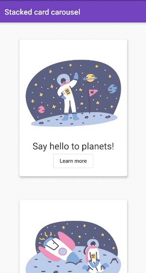
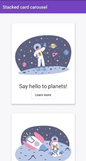
4. stacked_card_carousel
The stacked_card_carousel package is a versatile widget designed specifically for creating vertical carousels with stacked cards in Flutter. With its unique and eye-catching design, this package allows developers to create visually appealing carousel layouts that enhance the user experience and captivate users’ attention.
Key Features:
- Vertical Carousel: Unlike traditional horizontal carousels, the stacked_card_carousel widget enables developers to create carousels that scroll vertically. This vertical orientation offers a fresh and distinctive approach to presenting content, making it ideal for showcasing products, articles, images, and more in a dynamic and engaging manner.
- Stacked Card Layout: The standout feature of the stacked_card_carousel package is its ability to display cards in a stacked layout within the carousel. Each card is positioned vertically on top of one another, creating a visually stunning effect that adds depth and dimension to the carousel. This stacked card layout enhances the visual appeal of the carousel and provides a unique browsing experience for users.
- Customization Options: Developers have a wide range of customization options at their disposal to tailor the appearance and behavior of the stacked card carousel to their app’s design and branding. With configurable parameters for card size, spacing, animation effects, and more, developers can create carousel layouts that align perfectly with their app’s visual identity and user interface.
Easy Integration: The stacked_card_carousel package is designed to be easy to integrate into Flutter apps, allowing developers to add vertical carousels with stacked cards to their projects with minimal effort. By leveraging the package’s intuitive API and documentation, developers can streamline the development process and focus on delivering polished and immersive user experiences to their app’s users.
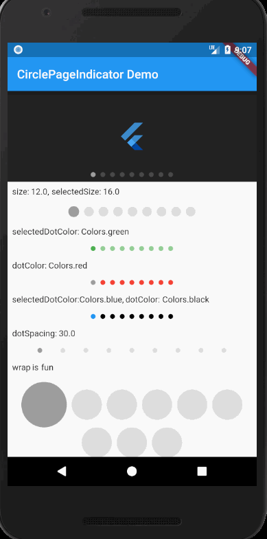
5. page_view_indicators
The page_view_indicators package offers a comprehensive set of customizable indicators for your PageViews in Flutter. These indicators provide visual feedback to users, helping them navigate through content seamlessly.
Let’s explore the different types of indicators and their customizations available in this package:
- CirclePageIndicator:
- Size: Customize the size of the circle indicators.
- SelectedSize: Adjust the size of the selected indicator.
- DotColor: Define the color of the inactive indicators.
- SelectedDotColor: Set the color of the selected indicator.
- DotSpacing: Specify the spacing between individual indicators.
- BorderWidth: Control the width of the border around the indicators.
- BorderColor: Customize the color of the border.
- SelectedBorderColor: Define the color of the border for the selected indicator.
- ArrowPageIndicator:
- RightIcon: Define the icon to be displayed for navigating to the next page.
- LeftIcon: Define the icon to be displayed for navigating to the previous page.
- IconColor: Customize the color of the navigation icons.
- IconPadding: Adjust the padding around the icons.
- Duration: Set the duration of the animation for switching pages.
- Curve: Specify the animation curve for transitioning between pages.
- IsJump: Determine whether to jump directly to the target page.
- IsInside: Control whether the icons are placed inside the PageView.
- IconSize: Define the size of the navigation icons.
- TooltipLeft: Customize the tooltip text for the left navigation icon.
- TooltipRight: Customize the tooltip text for the right navigation icon.
- LinearProgressPageIndicator:
- Width: Define the width of the linear progress indicator.
- Height: Specify the height of the linear progress indicator.
- Duration: Set the duration of the animation for updating progress.
- ProgressColor: Customize the color of the progress indicator.
- BackgroundColor: Define the color of the background behind the progress indicator.
- StepPageIndicator:
- SelectedStep: Define the index of the currently selected step.
- PreviousStep: Define the index of the previous step.
- NextStep: Define the index of the next step.
- StepColor: Customize the color of individual steps.
- StepSpacing: Specify the spacing between steps.
- Size: Define the size of the step indicators.
- AnimatedCirclePageIndicator:
- This indicator provides animated circle indicators for PageViews.
By leveraging these customizable indicators, developers can enhance the navigation experience within PageViews in their Flutter apps, providing users with intuitive visual cues for tracking their progress and navigating through content efficiently.
Conclusion
Implementing carousel sliders in your Flutter app can significantly enhance user engagement and create a more immersive and interactive user experience. By leveraging packages like ‘carousel_slider’ or creating custom carousel widgets, developers can easily integrate dynamic and visually appealing carousel sliders into their apps. These carousel sliders offer versatile solutions for showcasing products, articles, images, and more, while providing users with intuitive navigation controls and customizable features.
Through careful consideration of design, content relevance, performance optimization, user interaction, and A/B testing, developers can maximize the impact of carousel sliders on user engagement. By focusing on visual appeal, content relevance, and seamless navigation, developers can captivate users’ attention and encourage exploration of the app’s content. Additionally, by optimizing performance and implementing user-friendly interaction patterns, developers can ensure a smooth and enjoyable browsing experience for users.
Whether you choose to utilize pre-built packages or develop custom carousel widgets, the key is to prioritize the needs and preferences of your app’s users. By integrating carousel sliders strategically and thoughtfully, you can create an engaging and memorable user experience that keeps users coming back for more. So, don’t hesitate to explore the possibilities of carousel sliders in your Flutter projects and unlock new opportunities for user engagement and retention.